Showing posts with label Willworld. Show all posts

Wednesday, July 22, 2020

Seth's 48th birthday July 22, 2020


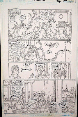
Perspective.  Seth was SO good at perspective.  He studied it of course, made a point of learning how it works, and how to use it.  But then he owned it, and he could play with it, as in the top page from WillWorld.  

Perspective gives me fits.  Seth recommended a book by David Chelsea, PERSPECTIVE FOR COMIC BOOK ARTISTS  which I am reading and trying to use, but I don't understand what he is talking about a lot of the time.  So it feels a little bit as though I am trying to read it in a foreign language.  

But especially today, thinking of Seth, I am persevering.  
 

Thursday, June 2, 2011

Willworld has been re-released

It looks like Willworld has come out again, in a $7.99 edition, as of May 23 or so.  And because of that, Seth is again getting some attention on comic book blogs such as this one, and this one
Willworld's pages bubble over with creative ideas, from the expressive borders around the frames, to the many quirky throwaway characters
to the fabulous architecture and machinery.
It has enough creativity flowing through its ink and cellulose veins to make several dozen comic books, I think.  I am amazed every time I go through it.  I am glad that a new group of comic book readers will be able to savor its delights, people to whom the $20 for the original was too big an expense.   

Tuesday, April 13, 2010

More giant heads

After posting the Easter Island picture yesterday, and noting that those heads were part of Seth's mental landscape, I remembered the giant heads that float all around Willworld. But on this page in particular, the large bottom frame has a head statue clearly modeled on the Easter Island ones. Those statues have fascinated people ever since Captain Cook landed there in 1774, but they became particularly meaningful, or maybe particularly memorable for Seth for some reason, and their imagery pops up now and again all through his work.

Monday, October 5, 2009

Superhero Art exhibition: We were there!


We didn't take many photos at the art exhibition. It just got too crowded (the picture at the top, of the hall, was taken before the general public was allowed in), and besides, Tofu (left) had spent too many hours in the car and was antsy. So we stood by Seth's pictures, here and in one other place, and tried to listen to what viewers had to say.

The exhibit is gorgeous. This is a serious look at superhero comic book art as Art, its history in our culture, how it reflects our inner longings, its evolution from the 30's to the present, and just, well, the pleasures it has brought to a lot of people.

The only drawback for me was that, while each piece was labeled, there was no commentary on the wall. I know that commentary is not always welcome; after all it is one or two people's understanding of what we should be able to see for ourselves. But when you take sequential art out of its context in a story, and a historically relevant piece out of its historical period, unless the viewer is a serious student of the genre, or at least a serious looker, it is hard to understand the importance or the value of a single work. Even though a person can see without having to have learned how, still, Seeing is harder than reading. Without words to explain what is happening, a person has to work harder to understand what is happening. That's why reading wordless books sometimes feels like Work: the reader is forced to exercise an often unused capacity.

The page on the wall to the right of Tofu is page 41 in Willworld: the giant eraserhead gestapo ruthlessly erasing a swath in retribution for Hal's "illegal" activity. It is one of the wittiest pages in Seth's repertoire, I think. We stood beside it and explained what is happening in it to several viewers, who then said, "Ah, now I get it. Wow!" That was gratifying.


Tuesday, September 15, 2009

Making a story clear

The other day I had a nice visit from Chris Ryall, the editor in chief at IDW Publishing in San Diego. He came by to bring me a complimentary stack of books of a graphic novel called Locke and Key, which has the story Freddy Wertham Goes to Hell added in the back. Both stories were written by Joe Hill, who also wrote the Spiderman Unlimited story that Seth drew. Chris, who is a fan of Seth's, wanted to see Seth's last work (even though his part of it was only the blocking out of the pages) printed in color, went to some trouble to get reprinting rights from Grave Tales, and then Seth's friend Langdon--who actually drew the pictures--did the coloring. All in all, it was a labor of love.

Interestingly, in the lead story, the first of a series, they printed not only the graphic story, but also the script that was given to the artist, Gabriel Rodriguez. Though I am not a fan of the genre (horror) I read the story, Locke and Key. The pictures are stunning, but I thought the story was hard to follow, until I read it with the script in hand, continually looking from the script to the pictures.

Now, please understand, for the most part, I am not a comic book reader. The only comic books I own are ones that Seth did. So I am not the audience for whom this book was intended. I also am SO VERY familiar with Seth's work that I see all the subtleties that probably most readers miss. HOWEVER, it seems to me that even though some of the stories that Seth illustrated--notably Willworld, and the two issues of Doom Patrol--make jumps of logic that continually befuddle the reader, the pictures give details that clarify some of the more abstruse questions. I wondered what Seth would have done with the scripts that Gabriel was given. A useless question of course, but it brings out the matter of how to make a story clear.

I'd like to talk in the next few postings about some of the issues that give clarity to a story.


Issue number one: Who are the characters?

How do you identify the various characters? Line drawings of faces can be very general, especially when they are printed small enough to put several boxes of them inside a page that is about 8" x 10".

Here is something that Seth said to an aspiring artist about making characters identifiable:
"Try to design characters so that they are identifable 360 degrees around. Ie the mohawk is a good design since you can ID the character from the back of the head so it gives you more options for angles to take in the scene and still keep things clear. You can use hats, clothes, a bird on their shoulder, whatever...."

In this page from Willworld, the cast of characters has their own peculiarities that give them instant readability: Hal of course wears the green mask. But even in black and white, his face is recognizable. His hair falls lankly down on his forehead, and he has that bewildered expression. Mu-Fon has no nose, and a beret and turtleneck sweater. Kelly has six arms. Even the people at the bar who we see only once in the story are all recognizable as individuals, both from their clothing and their facial style.

Monday, August 17, 2009

Superhero Art exhibition


I used to turn semi-regularly to an online listserve where buyers and collectors of original comic book art prattle and wrangle about their purchases, about what artists they like, and about collecting comic art in general.
Eventually I stopped reading; there was not much they had to say that was interesting to me. But on one rare visit to the site, there was a letter from one Ben Saunders, asking for contributions to an upcoming exhibition at the University of Oregon of original superhero art.

I contacted him, told him who I was, and that I have in my possession most of Seth Fisher's art.

Not only did he know Seth's work, he knew--without any prompting--the details of various individual pages of Seth's work. This is a guy who either has a photographic memory of every comic book he has ever read, or who has really loved and noticed Seth's work in particular. Probably some of both. We made arrangements for him--representing the university--to borrow six memorable pages of Seth's art.

The exhibition, which is titled "Faster than a Speeding Bullet: The Art of the Superhero", will begin on September 26, and continue through January 3. It is a HUGE show, and will contain work by some of the originators and biggest names in the genre. Seth would love to be in such company.

I posted above two of Seth's pages that are in Oregon now awaiting framing. I'll show you the rest of them soon. If you are going to be anywhere near Eugene, Oregon from the end of September through the end of the year, you might want to go make a visit. We'll be there for the opening.

Thursday, July 2, 2009

Influences on Seth: Winsor McCay

Winsor McCay was a pioneer in the drawing of comic strips. He was, according to the things I have been reading about him, the first to set his comic stories in other than the real world, the first to use surrealism in his work, though what he himself wanted most to do was to draw beautiful pictures. His Little Nemo in Slumberland seems to have been the the first comic in which panels might change shape as an aspect of the story, so the panel shape became actually part of the artwork. This is one thing that Seth gloried in, and used especially robustly in Willworld, as you can see in this page, where Hal has come in contact with this hallucenogenic globe, and just bl0%*#>+=*~~s into never never land. This is an especially McCayish page, with Hal in his 19th century style nightshirt and nightcap (not that Little Nemo wears either one) and heading off to a sleep that is sure to have weird dreams.
There are several other aspects of Seth's art that owe something to McCay. In his style of drawing, where he didn't use shading, and not even much black, he needed some way to make the important parts of the image stand out. He did it by using heavier and lighter lines,

as McCay did. It seems to me that he did this consciously, after discovering McCay's work while he was in college. Seth's first or second multi-page booklet is a story he wrote in the style of McCay's "Dreams of a Rarebit Fiend" that starts out ordinary and grows more and more fantastic, ending with his heroine falling out of bed saying, "I knew I shouldn't have eaten that rarebit right before bed."

Also like McCay, Seth wanted particularly to draw beautiful pictures.

Thursday, February 26, 2009

Willworld pages 12-13

I apologize about the quality of this image. It's a photograph of the page, and the flash lit up the right side a lot more than the left. I bought these pages from Seth. When he got his Willworld originals back from DC, I think he asked me if I wanted to buy anything, and I chose the best, I think. It is a scene from the story, but really it stands alone. It may bring to mind the bar scene in the first of the Star Wars movies, the 1976 original, where Luke Skywalker goes to try and find someone with a ship to take him to find Princess Leia. In this scene, humans of various nationalities and professions drink at the bar alongside dinosaurs, semihuman creatures, wizards, Mother Goose characters, fairies, and and and... In this place nothing surprises you; it's all just part of the venue.

Friday, February 6, 2009

Willworld page on eBay


A sharp-eyed friend alerted me to the fact that this page is up on eBay for sale. This is another one that I have never seen in the flesh. A real beauty. The image I posted is not so good, for which I apologize; I just copied it from eBay. Here is the link to the sale page.

Hal has consumed--or been consumed by--some mind-altering substance which takes him through a liquid world beneath the surface of his mind. It's a world of weird, watery beauty, much like the ocean that Seth loved. You can't tell from the top what is inside; you have to immerse yourself in order to see anything. And, as you can see from the picture, it is very worth doing.

Thursday, January 1, 2009

Happy New Year! something just for fun


These are extra spot drawings for Willworld. The upper left drawing was printed on the inside back of the dust cover of the hardback version. The rest of them seem not to have made the cut, at least I can't find them anywhere in the book. The editors missed an opportunity to showcase Seth humor with the bug carrying a large peanut to the creature (Hal's long-nosed mount as a baby). I think it took a while for Seth's editors to appreciate the humorous notes he delighted in introducing into whatever artwork he did. The last two stories he drew were for Marvel Comics, who relished everything, and I think DC would have eventually come around. Now they all appreciate it.

Monday, November 17, 2008

Willworld pages 80-81

This is a few pages earlier than the last one I posted. It is a two page spread of what happens as the Land of Odd is destroyed and the forces of chaos seem to be consuming everything. All the citizens, head police, soldiers, and creatures of Odd are trying to escape the apolcalyptic destruction. The one person who seems the most--mmm--personal, I guess I would say, is the one at the bottom left of the large picture, with the mohawk and the nose jewelry who is looking out and grasping with his hand toward the reader. For some reason that person reminds me of Seth, not Seth's looks, but Seth's art. He has an intimate association with the reader; he is making an attempt to climb out of the page and relate to the reader; he seems to be asking the reader for help.
That device is occasionally used in post-Renaissance art, where some person in the foreground who is not the main subject reaches out or looks squarely at the observer. The idea was to bring the observer into the painting, to make it nearly impossible to turn away. It works, I think. Many things are happening in this picture; the World as They Know It is being crushed. We see this one person appealing for mercy, and we feel involved.

Friday, November 14, 2008

Willworld's denoument: page 93

As befits a page where the hero has undergone his testing, has passed, and is now coming back to earth as it were, this page has the look of a normal comic book. The frames are rectangular, the spaces between the frames are consistently the same width, and nothing is leaping from one frame to the other. It is in fact, one of the few pages in the book where that is true.

What I referred to as a lighthouse in an earlier posting appears here also with Hal emerging from it victoriously. I am looking at the color book too, and I now realize that it is in fact The Green Lantern. I had forgotten that was his schtick.

So now, like Luke Skywalker in the first Star Wars movie, and unlike such lone rangers as Batman and Spiderman, Hal is clearly seen as one of a corps of knights, part of an army, and not someone whose power depends on some mutation or personal accident. Hal is not on his own. Also like Luke Skywalker, some of his fellow Green Lanterns are human and some are something else. I don't know how much of this information is Seth's take on it, and how much is part of the general background for Green Lantern. But Seth has designed the architecture, the faces of the overseers that we see here and on page 66 and 67, and the faces of the nonhuman knights. Even the throwaway details of architecture have the look of someplace that we could visit and find out more about if only we could go behind where they are standing...

Thursday, November 13, 2008

The Climax of Willworld: page 92

I think I have posted this rather spectacular page a couple of times already in different contexts. I apologize for repeating things. But after posting the pages leading up to it, and the intense psychological/spiritual trials that Hal faces in the book, it seemed only fair to post also his victory over the chaotic forces of his own psyche.

A few interesting things about this image of victory:
~The squidman does not entirely explode: just his head (the source of the chaos).
~The head explodes, not with fire and lightning, but with bubbles--possibly there was nothing really there at all. In any case, the explosion does not cause harm to those around him, it merely bursts the bubble. It actually seems to explode like an overblown balloon: it appears to have gotten bigger and bigger until it just popped with a huge noise.
~The sound word, PsycaBOOOMM!!--another of Seth's words--is not only the sound, but actually part of the explosion.
~The explosion, or the fact that Hal actually flew into his mouth--sends the squidman reeling backwards, so the thrust of the energy of the image goes diagonally from bottom left to top right. Diagonal lines, and diagonal flow of energy, always has more movement than horizontal and vertical flow. There are no vertical or horizontal lines in this image. The circles are calming, but the energy is all outwards.

Wednesday, November 12, 2008

Approaching the climax: Willworld page 91

This page, which in the book is across from the page I posted yesterday, shows Hal standing on top of a rather ornate building, one that I am not sure I see anywhere else in the Land of Odd, except for the number 100, in the knobs or whatever-they-are that were in yesterday's page as well. (I don't know what those refer to. Does anyone else get that? I keep feeling as though I have missed something obvious.)
So his bubble--his shield--seems to have burst, and he is alone now, unprotected from the unknown and chaotic recesses of his unconscious. We see him from a point of view above the exposed brain of the squid monster he is facing. He looks small and vulnerable. All the lines in the picture are pointing more or less toward him. But there is also that circle at the bottom where he is even more exposed, with his hands outstretched so that he doesn't even have his own arms covering his body.
Interestingly, the colorist has changed the emphasis in subtle but definite ways in this page. In Seth's original, all the people in the top frame are drawn with the same line weight; in color only Hal has black lines around him, the others are in light brown, and colored in hazy colors, so that Hal seems real and the others seem imaginary. In the original Hal in the circle at the bottom has a surprised look on his face; in color he looks horrified. I wouldn't say the color makes it wrong; it raises the level of tension. Argument could be made that it makes the storyline clearer. For myself though, I prefer the black and white almost always.

Tuesday, November 11, 2008

Drawing on the unconscious: Willworld page 90

Seth must have spent time remembering his dreams, and visualizing his subconscious thoughts. I wish I had talked with him about Willworld, and found out how he came up with the particular images he used for some of these things. There are many undersea images: squidmen, fish, watery places. Those I can see; the sea is a powerful source of dream material, and Seth was very familiar with it. He loved to dive, to spearfish, and to just spend time in the sea. But it has dangers too, which you have to respect in order to be intimate with it.

The creature here who is the whirlwind of Hal's unconscious mind has an exposed brain, samurai armor which seems to be holding his tentacled body into a human-sort of shape more than protecting his body. What lies underneath may be even more threatening.

In this page the tentacled creature--his unconscious--is preparing to consume Hal, though it's difficult for me to tell whether the bugs in his mouth are going in or coming out. Either way is frightening.

Seth has arranged this page with small simple frames at the top that are mainly just recitative: just to carry along the story. He has saved the big spaces for a large image of the creature about to overcome Hal, and at the bottom, Hal himself protecting his face from the onslaught. The small upper frames have Hal very small; he is a little larger in the middle frame, and he is largest at the bottom where he is just about to become meat. This progression of sizes goes from wondering what to do (small), being threatened (larger), and being almost consumed (largest). The bottom frame shows Hal being thrown back into our lap: we and he are one. Aghhhhh, he's on me! What would I do?

Wednesday, November 5, 2008

Will and Imagination: Willworld page 84

It is interesting to me to read Willworld again like this, slowly, savoring all the ins and outs of Hal's wierd journey. It becomes clear that Seth was at least partly responsible for the content of this book. He said so, of course, but I didn't know how much of it was his and how much was general Green Lantern schtick, and how much was the author.

In his own life Seth worked hard to develop both his will and his imagination, in order to become the best artist he could be, indeed, the most complete person he could be. He felt that there was no limit to what a human being could do, that people are not limited by the restraints of the natural world. He wanted to overcome his weaknesses and find a sort of resonance with the universe.

Hal's journey reflects this point of view, and this page shows in images how it works. In the two upper panels Hal is alone, but he is surrounded by throngs of people who believe in him, who have either completed the same sort of training that he is immersed in, or are going to do it.

In the two lower panels we see what appears to be a giant lighthouse beacon, and Hal entering into it, and dissolving into something that seems to be taking away his humanity. He doesn't know for sure whether he has the power, the will, the understanding to go through this set of experiences and come out stronger, or if he will be consumed by what is happening. He can't know until he goes through it. Seth saw life's challenges just that way, and like Hal, was determined never to shy away from them.

Saturday, November 1, 2008

Literal and Graphic, part two


These two pages are not really comparable, except insofar as they are both pages where something quite dramatic is taking place. But it is interesting to see side by side the difference between Seth's more literal work in Willworld, and his more graphic work in Big in Japan.
In both pages the main person has body decoration. Dr Yamane's decoration is entirely graphically portrayed, as even circles on his bare skin, though if we were to see a photograph of someone with such things, the circles would vary considerably with the contours of his body. In fact, I would presume to say that if Seth had drawn a person in Willworld with circles painted on his body, we would see his body contours clearly through the undulations of the circles.
The warrior in Willworld an ancient Chinese sort of armor, which is also a kind of decoration for his body. Here each of the rows of bamboo, if that's what it is made of, is intricately drawn and the rivets are all in place.

Wednesday, October 22, 2008

Control: Willworld page 77


Judith Johnson's next component of illustration:
"Control of the medium: Finally, we discuss whether the illustrator demonstrated adequate control of the medium used. What is the level of their ability? Their virtuosity? If we look at two illustrations from two different periods of an illustrator’s career, can we see improvement or change in the rendering? Control of the medium is more subjective than content, composition and color. We can usually tell, however, if an artist has drawing skill. By just looking at the illustrations, we can gain a sense of visual mastery or lack thereof. Students become more adept at judging an artist’s control of the medium as they become more familiar with his or her work."

The more I study Seth's work in writing this blog, the more I am amazed at his control of the medium. He could draw anything and make it work. He could draw scenes of confusion and show clearly what the protagonist was doing and what was important. He could show the passage of time. He could show us without saying anything that it was a time of sadness, or terror, or delight. He was not afraid of the work it took to make the characters, the scenery, the buildings, the machinery, all the parts seem real and weighty.
Even though Willworld is early work, it is lush and realistic in its depiction of real world phenomena, though its subject matter is the subconscious. The scenery in the top frame is quite gorgeous, even with the monstrous threatening blob headed out from behind the cliffs. The pen and ink clouds read as clouds. He could draw a six-armed woman as comforting rather than just peculiar. The ragged snapshots at the bottom are completely understandable as flashbacks to Hal's childhood.
Tomorrow I'll post something from Big in Japan, which in comparison is a lot more clean and stylized than his earlier work.

Tuesday, October 21, 2008

More composition: Willworld pages 75--76


"What is the quality of the lines in the illustration? Are they thick, thin, horizontal, vertical, diagonal, straight or curvilinear? A thick vertical line might represent strength (think of a tall oak tree). A thin, curvilinear line might appear feminine and lyrical (think of a flower stem, bending in the wind). A diagonal line might appear visually startling (think of lightning)."


Seth's lines are always a combination of thick and thin. The thick lines surround the actors and important props in the scene, the thin lines are for details and texture.

The first of these two pages shows many straight lines: architecture from approximately the 50's, with the wild curving lines of the onslaught of the hydra of the unconscious (Thank you Gareth) breaking through the roof of the house, and the roof of Hal's head.
Then in the next page curves abound: soft, even curves--the dream of childhood, where everything was taken care of, one was safe in ones own home, protected from the ravages of this fallen world. The shapes of the upper frames are curved, irregular but simple, a time of dreams. Only the bottom frame has the right angled sides, where inside it Hal and his friends sit in the rubble and wonder what has happened.

Monday, October 20, 2008

Composition continued: Willworld page 74

Judith Johnson continues:
"Next we look at the picture plane, the imaginary or real line that surrounds the illustration. Is it full (lots of things are close together in the drawing)? Or sparse (few things, far apart in the drawing)? Is the picture within the plane or does it break out of it (are there parts of objects which extend beyond the picture plane)? What is the shape of thepicture plane (is it rectangular, square, round, oval, or shaped by the objects within it)?"

In this page at least, the picture is pretty full of Things. One of the qualities that Seth's work is known for is the abundance of detail, and this page is no exception. The surface is densely covered with lines. Seth's lines are never just texture or shading, however: it's full of information. But he used small details to show depth and--as in the Big in Japan cover that I posted last--to make a group of things or beings function pictorially as a single unit. The hordes that are attacking our protagonists are separate, but seen as one single large threat. Our friends are each drawn separately, each in his/her own space. They are individuals; the creatures in the attacking army are not.
But Seth was not afraid of open space in his drawings. The area above Hal and his friends is blank except for the words. Dense detail requires some open space so the viewer's eyes can rest a little bit.
"What is the quality of the lines in the illustration? Are they thick, thin, horizontal, vertical, diagonal, straight or curvilinear? A thick vertical line might represent strength (think of a tall oak tree). A thin, curvilinear line might appear feminine and lyrical (think of a flower stem, bending in the wind). A diagonal line might appear visually startling (think of lightning). Does the artist use implied line? Implied line happens when a line begins in one object, such as an arm pointing, and continues in another object such as the crest of a hill. Our eyes do not see two different lines, but one continuous line is “implied.” Implied lines can also be seen in the combined edges of things, especially when the artist ends linear items such as hair or tree limbs in one continuous curved line."
This picture has, not so much implied line, as it has implied continuity of movement.
In comic book work the artist has several pictures on one page to work with, and so he has more opportunity than single-image artists to make the images work or play together. Seth loved visual puns (and verbal ones too). In the bottom two frames on this page, the advancing army begins to press against Hal on the left, and then on the right it seems as though the same group from the left is just leaning so hard on him that he can't remain upright. The shield that he holds in the left frame acts like open space which makes the movement in the two frames go from upper left to lower right, pressing Hal and his friends into the bottom of the page. The hordes are not so much threatening as they are carelessly trampling everything in their path.