Recently I came across an article in a Catholic publication that talked about the increased sense of wonder and attention to detail that the author developed from playing the video games in the Myst series.
In traversing the lands in Myst, searching for clues to unlock the mysteries, "nothing is meaningless," says the author. "All points to a pattern beyond itself." I now know that life is like that: complex and full of meaning, and it rewards efforts to find what is below the surface.
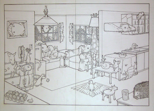
I played Myst 3: Exile when it first came out, before Seth died. In playing I would lose track of time navigating its scenery and machinery; and more often than I like to think, two hours would go by before I came up for air. I was new to video games. (Even now, except for a very few small forays, Seth's games are the only ones I have played.) But it was so beautiful, so haunting, that images from it still appear in dreams and in my vision at other odd times. I was very disappointed--though also slightly relieved--when I had to get a new operating system, and it would not support Myst. The beauty and draw of it, and the duties that called to me were irreconcilably at odds.
When I found the article referenced above, it gave me a rationale for looking to see if it could still be had, and played on Windows 10. The answers were Yes, and Yes. And it could be had for under $10. So I bought it, from GOG Galaxy.
Now, as an old lady, and a non-gamer, I am sure I don't know anything that my readers don't know, but since I found it, I thought other people who might have wanted to reconnect with this intricate and compelling game would be happy to know that even the likes of me can find and install it.
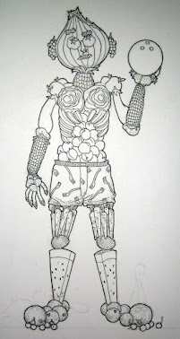
One more thing. The first age, J'nanin, was designed by Seth. (He also designed the last age, Narayan.) When I was playing Exile the first time, I expressed my frustration to Seth that though I could walk all over the island, I couldn't figure out how to open anything. He said, "It might help to make a map of the island." That was all the clue he would give me, but it was enough.


.jpg)
.jpg)
.jpg)
.jpg)