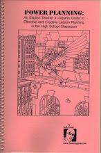
 Seth drew this cover but not the inside of the comic book. The original is owned by Michael Farineau, who bought it from Seth some years ago and was kind enough to send me a HUGE copy of it. It looks as good--maybe better--four times the original size as it does 11" x 17". Michael also sent me the text of some e-mails that were exchanged between Seth and the publisher (Penny Farthing Press), that give an insight into his relationship with people he worked for. These were printed in the back of the comic book.
 To me this fabulous image is wasted when it is printed small enough for the outside of a comic book.
Here are the letters that Seth wrote:
*
*
Hi Teal. I read through your packet this evening and drew up a few ideas. Basically I feel like the two most interesting moments (visually) are the confrontation (fight) between Halle and Abathor, and when the city on Zendra starts to crack open.
I did a bunch of sketches of them fighting and am enclosing the one I like best. The idea is that she is flipping over his head about to go for the neck and they are just making eye contact, but their bodies are upside down relative to one another.
The second idea I didn't develop very much because I wasn't sure of the architecture of the city. My Initial image is of a french village with tech stuff interwoven into it in places, but if that is too far from the actual art it may not seem to make sense. Please advise me about the "look" of the town. The idea was just a shot of the town with a crack (or fissure) opening up down the middle of it. It seems like it might look too literary for a comic book rack the way I have it presented, but i could spice it up too. Of course, if you want to go this route I will get you some more dynamic angles, etc.
I considered your suggestion about the opening of the tesseract as the cover theme, but I had a hard time finding a narrative that leapt out from the cover art (An editor once told me that it doesn't matter if a cover is true to the interior or not so long as it tells a story. I don't completely agree with the first part, but I think the second part is good advice for any illustration.) And again, I was worried about my image of the Planet being too radically different from the interior artist's.
Guide me, Teal.
Seth
Hi Teal. This cover has been kicking my butt. Anyway, I did some preliminary pencils to get the composition right and then added a little color to get the idea for how I would show the volume before I drew all detail in the background. So basically, I need to know if you dig the direction I got going. It is growing on me, but there are a ton of little problems that I hope I can work out. Thematically it has evolved to show the planet behind them so we get a cover really beginning to capture all of the events in the book. I know the shapes need more volume, etc., but give me time. If you can get back to me on friday (today) the I will do finishing pencils this weekend. I still need to properly design the characters and background...this is mostly for layout, so please feel free to expect something more marvelous than what is shown. Tell me if you need to see those before I ink them or not. I don't mind either way; it's mostly a matter of speed. Your art Slave. seth
Hi Teal. Christmas Eve and I have just finished the line art. It looks pretty good I think. I hope I can give it a bang with colors. If there are any problems please tell me asap. I think I can wade through the coloring before New Years, but we'll see.
seth
Ok, disregard the last two pages...this is lot closer. sorry to send you so may things, but I have been slowly chipping away at this day by day. I hadn't initially wanted to use such bright cool/warm contrasts to define my spaces, but I got frustrated with my other methods. This is not quite the final version but I hope it is pretty close. I gotta say that the colors look nicer in photoshop than they do on my web browser...You should get these on Monday so call me and I can get any changes done and send it out Tuesday. Thanks for the x-mas card.
seth
Hi Teal. I sent off a disk to you today snail mail. After sitting in line for 30 minutes in the post office I realized maybe I should have fed-ex'ed it but it was too late. Anyway I am mostly happy with the piece. When you get it, look at it and see if it will work. If you need more stuff done on it I still have the files and we still have a little time. They are at 10x15 @ 300dpi. I wouldn't down-res it unless you have to since my line-work is pretty fine. I hope you guys dug the cover as much as I liked working on it.
seth


No comments:
Post a Comment