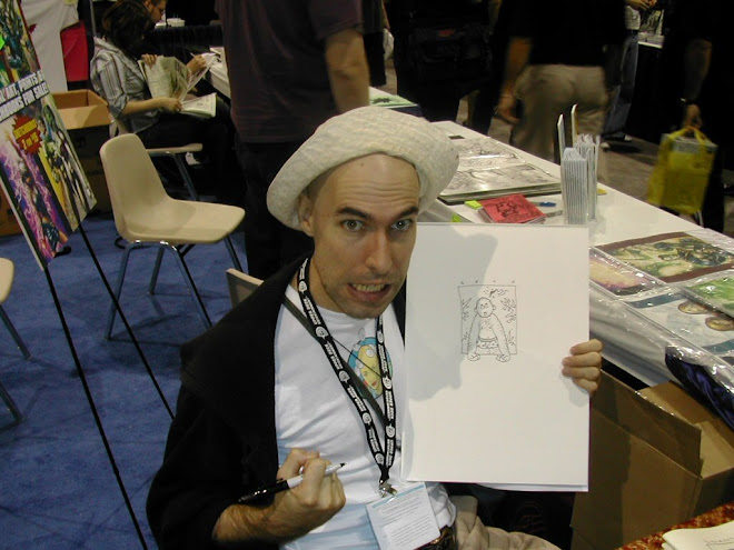
Forty-two sounds old, doesn't it?
I thought that for this birthday I would talk about some ways that Seth has helped me with my own artwork. If there are readers who would like to do the same, please let me know; I'll be glad to donate a day or two (or more!) to others who have learned from him. I know that there are art teachers who have used his work to teach various lessons: perspective for one... What other things have teachers used his pages to teach their students?
When I was first trying to illustrate books, and just doing some preliminary pages--this was maybe 17 or 18 years ago, before Seth had gotten recognition for his own work--he looked at what I had done and said, "You could put some things in the picture in front of your characters, so the people are not always in the foreground."
The image from Cicada is a powerful example of this sort of illustration. The single person in the picture is in the middle ground doing something fairly innocuous: knocking on the door of a cabin. The axe stuck into the meandering-rooted tree stump in the foreground as well as the bare trees and huge moon in the background give an ominous feel to an illustration for a story that has a twist at the end.
I haven't learned to do it in such a powerful way as Seth could do, but I have tried to put his advice into some of my work, for example, in this illustration for a story about a girl who is looking for some lost ducks.
I thought that for this birthday I would talk about some ways that Seth has helped me with my own artwork. If there are readers who would like to do the same, please let me know; I'll be glad to donate a day or two (or more!) to others who have learned from him. I know that there are art teachers who have used his work to teach various lessons: perspective for one... What other things have teachers used his pages to teach their students?
When I was first trying to illustrate books, and just doing some preliminary pages--this was maybe 17 or 18 years ago, before Seth had gotten recognition for his own work--he looked at what I had done and said, "You could put some things in the picture in front of your characters, so the people are not always in the foreground."
 |
| Seth illustration for a Cicada story |
The image from Cicada is a powerful example of this sort of illustration. The single person in the picture is in the middle ground doing something fairly innocuous: knocking on the door of a cabin. The axe stuck into the meandering-rooted tree stump in the foreground as well as the bare trees and huge moon in the background give an ominous feel to an illustration for a story that has a twist at the end.
I haven't learned to do it in such a powerful way as Seth could do, but I have tried to put his advice into some of my work, for example, in this illustration for a story about a girl who is looking for some lost ducks.
 |
| Vicki illustration for story "Quack and Daisy" |
Another thing I learned from Seth is that no one is responsible for the shape of the illustration except the artist. He simply said, "You are the master of your page." That means to me, if something doesn't fit, it's not because there is too much that you have to include; it's because you need to rethink how it all should go together. If the parts don't cohere, there is another way to use them. Seth seemed to be able to put disparate parts together in a way that made an image beautiful, dramatic, clear, and dynamic. This is one of my favorite images of Seth's, for just that reason: disparate parts put together to tell the story clearly and in beautiful form.
 |
| Seth illustration from Vertigo Pop Tokyo, issue 1 page 24 |
From my own work I can only say that there are some times when the picture just doesn't work, either because it doesn't include the same information as the story does, because it is in a horizontal format and what is needed is vertical, or sometimes just because it is dull.
Below is one of the pictures I struggled with. The one on top is the first try, and the one on the bottom is the final. There were two inbetween. You have to be willing to toss what doesn't work, even when it has some good parts. More that I learned from Seth.


4 comments:
A wonderful little essay, Vicki.
Thanks for sharing!
There's more to write about this subject. I'll add another next week if I have time.
I am glad to hear from you Jay.
I'm so happy I found this!!! I'm a huge fan of Seths work!!!!!
Dear mxytsplyk,
I am glad you found us too. I don't write here often enough, but occasionally... You are welcome to write to me via the website, and I'll answer you sooner--and more privately--than in the comments.
Yours, Vicki (Seth's mom)
Post a Comment