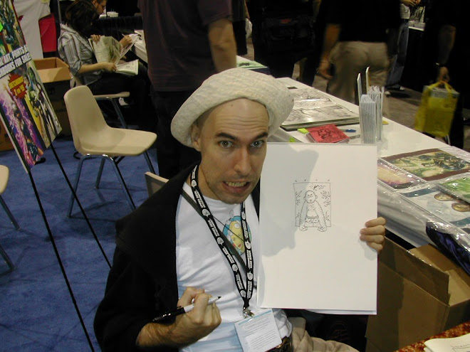
 In the interests of showing part of the process of creating works of art, as well as the finished works, the curators of this exhibition have included both this sketch for Vertigo Pop: Tokyo as well as Seth's sketchbook, which includes his roughs for nearly all the frames in the first issue of the story.
When Seth started working on this story, he was here in San Diego. He and his first wife were in the process of getting divorced, and he was living in the garage of their house. He had his slanted art table set up by a window, for natural light, though he had electric light as well. He had an electric heater at his feet (always--he liked to be warm). And he had this page, done on official 11" x 17" DC illustration board, pinned to his bulletin board.
He had worked out the norms of the style he was going to use for the figures in this story in the sketchbook: rubbery arms and legs with not much in the way of knees, no noses at all, those lips that look like two sausages: a manga-style look. But on this page are his references, for a consistent look throughout the whole of four issues.
The other manga style effect was his use of very realistic, detailed backgrounds. He was impressed with Japanese artists' deft combination of two rather different stylistic modes in one piece: clear, realistic backgrounds in good perspective, plus cartoonish figures. The real background gives weight and believability to the story, while the cartoonish people can show inner emotion more vividly than people (especially the notoriously reserved Japanese) usually do in public. Taken as a whole, the style gives the possibility of big drama to a story.


1 comment:
Very cool. Thanks for sharing.
Post a Comment