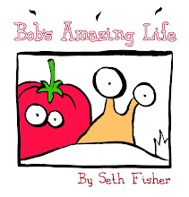
 In Seth's later work he got away from slavishly realistic images, and drew faces in a Manga style (especially for this book), and pages with a graphic design sense. He knew the difference between a realistic style and a graphic design style.
 He wrote the following to an artist who came to him for advice:
"I think its time for you to decide if you are going to commit to more graphic representation in your characters, or if you want to swing towards a more literal, spatial representation. Of course both are fine, but you seem to be kind of stalled in the middle.
"The graphic representation will allow you all kinds of flexibility with story telling and give you a more salable product faster i think. Though you gain a lot of versitility by drawing things very literally in the long run. Am i making sense?
"Taking a graphic attack means that you can represent your scenes figuratively..making fire come out of your characters eyes kind of ally mcbeal style. Look at design work and try to make the impact of each panel intensify the story. That would mean simplifying somethings too probably and paying closer attention to the design of the characters from the start. using patterns and maybe more blacks and whites.
"The literal approach means really getting strict with yourself and having a mirror handy in front of you at all times and everytime you dont know how a fold of cloth would bend, you check and see. Every time you arent sure about how perspective works you work it out on scratch paper until you figure it out. Its all knowledge that you carry with you forever, so its a good investment..but it takes time."


No comments:
Post a Comment